
-
Program:
Commercial
-
Status:
Built, 2019
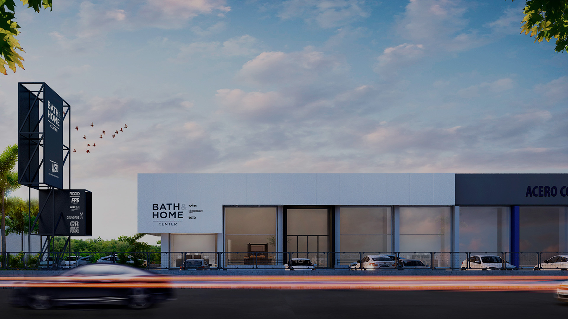
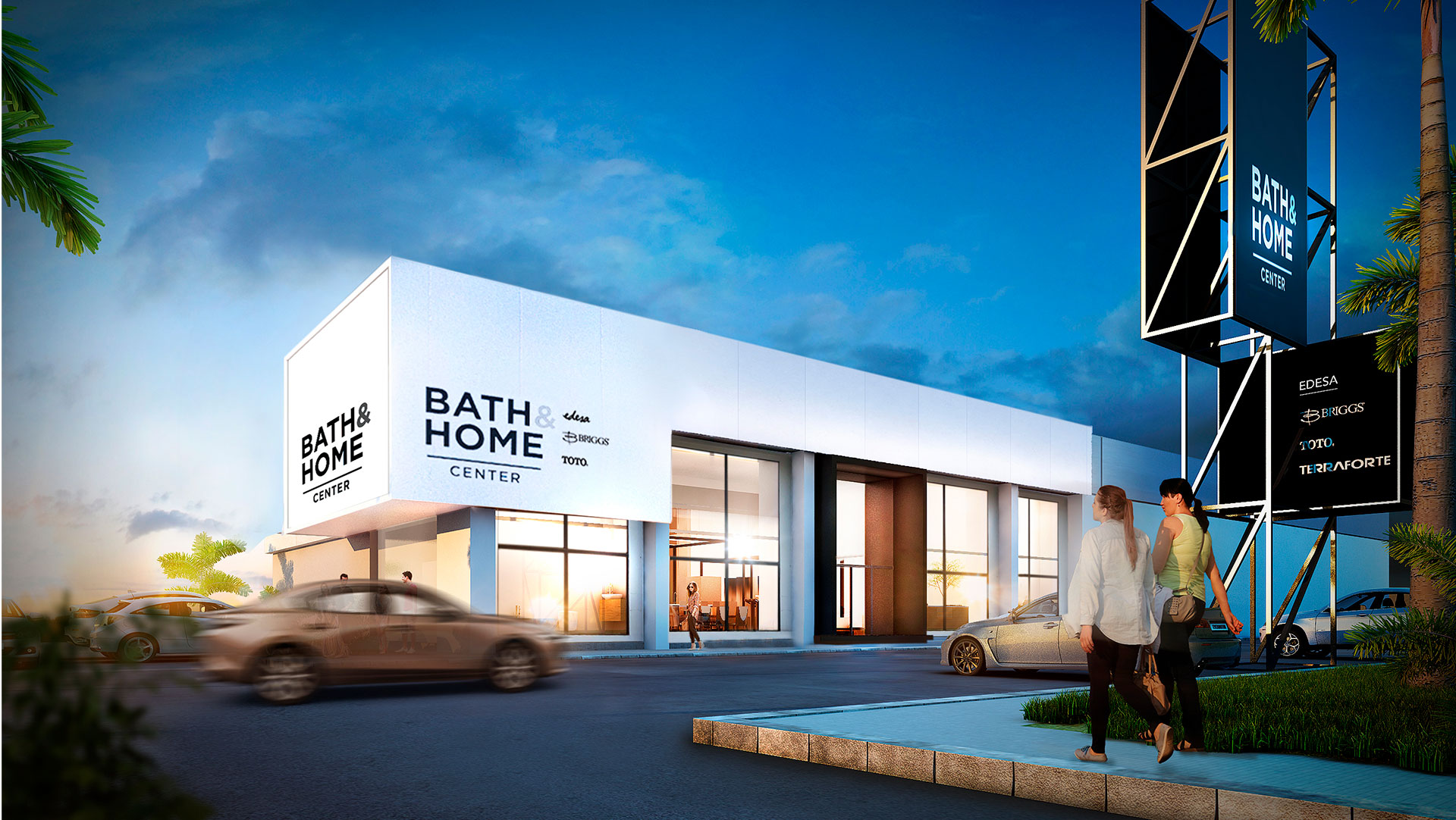
Our work together with the Ecuadorian store specialized in construction finishes and in design and decoration consultancy, Bath & Home, started with the architectural design and communication strategy for the Juan Tanca Marengo branch, which was then replicated in Cumbayá and San Rafael, two other branches of the brand undergoing redesign.
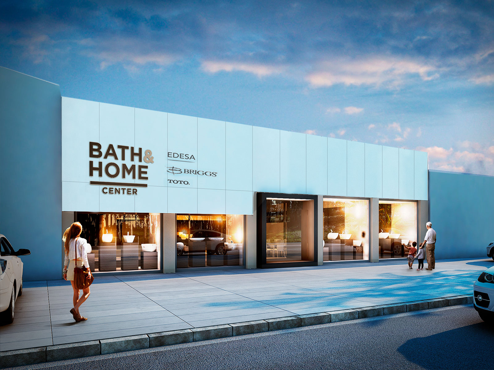
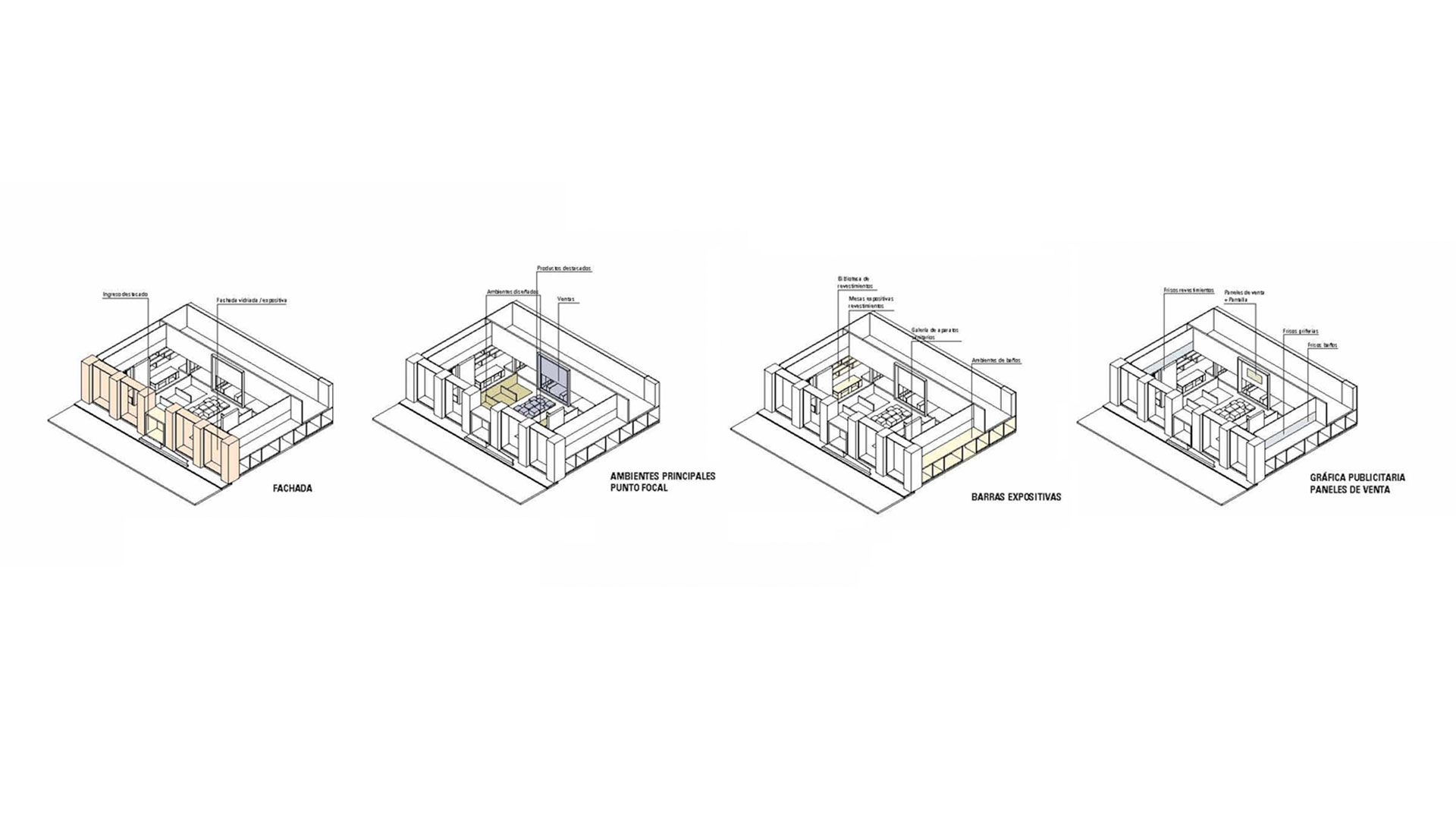
The general objectives of the project were changing the look and feel of the brand, reorganizing the interior space of the premises, modifying the facade, applying the brand and developing a messaging strategy that accompanies and enhances the transformation. The design strategies were forged from the needs identified in the first large showroom, which they shared with another brand.
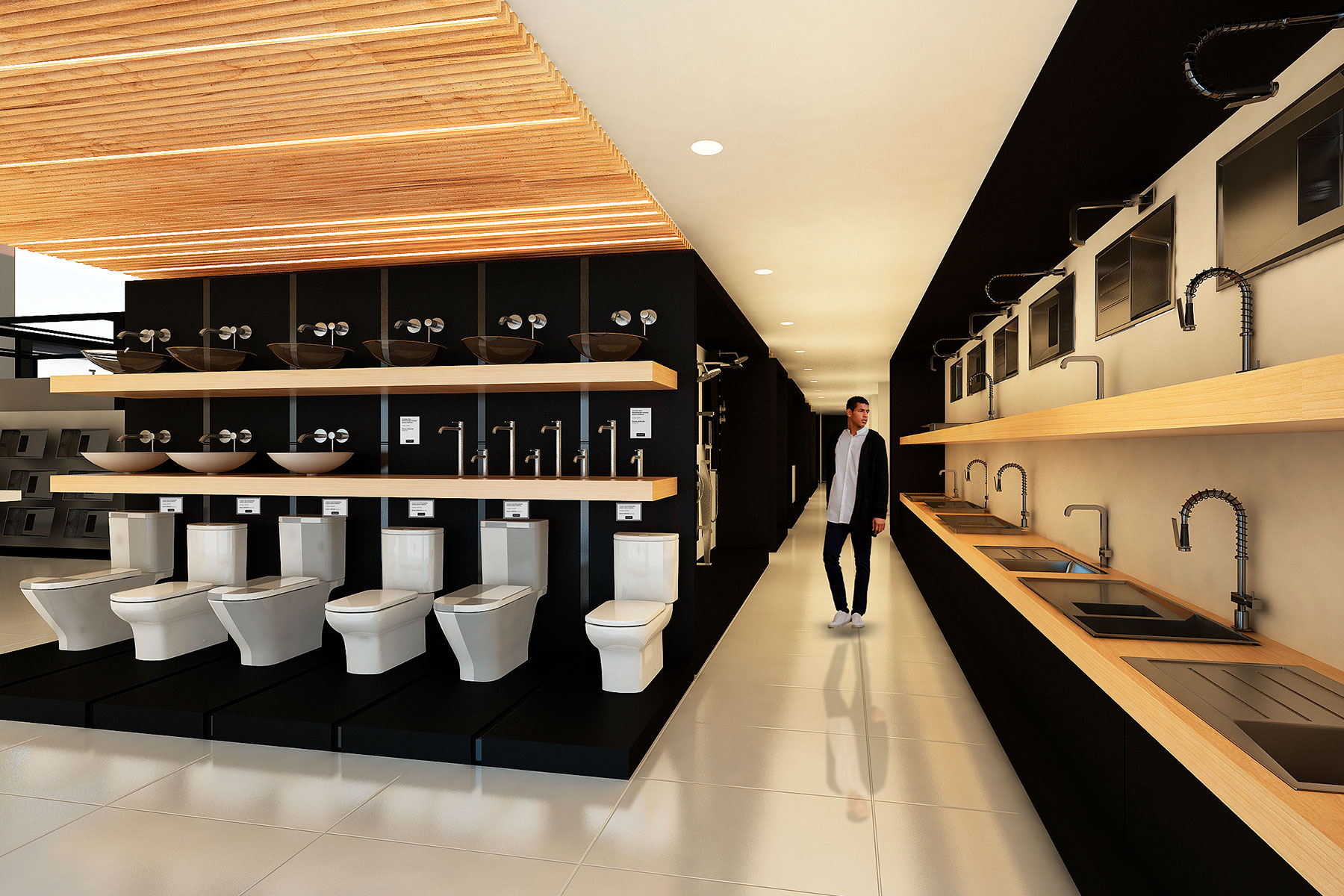
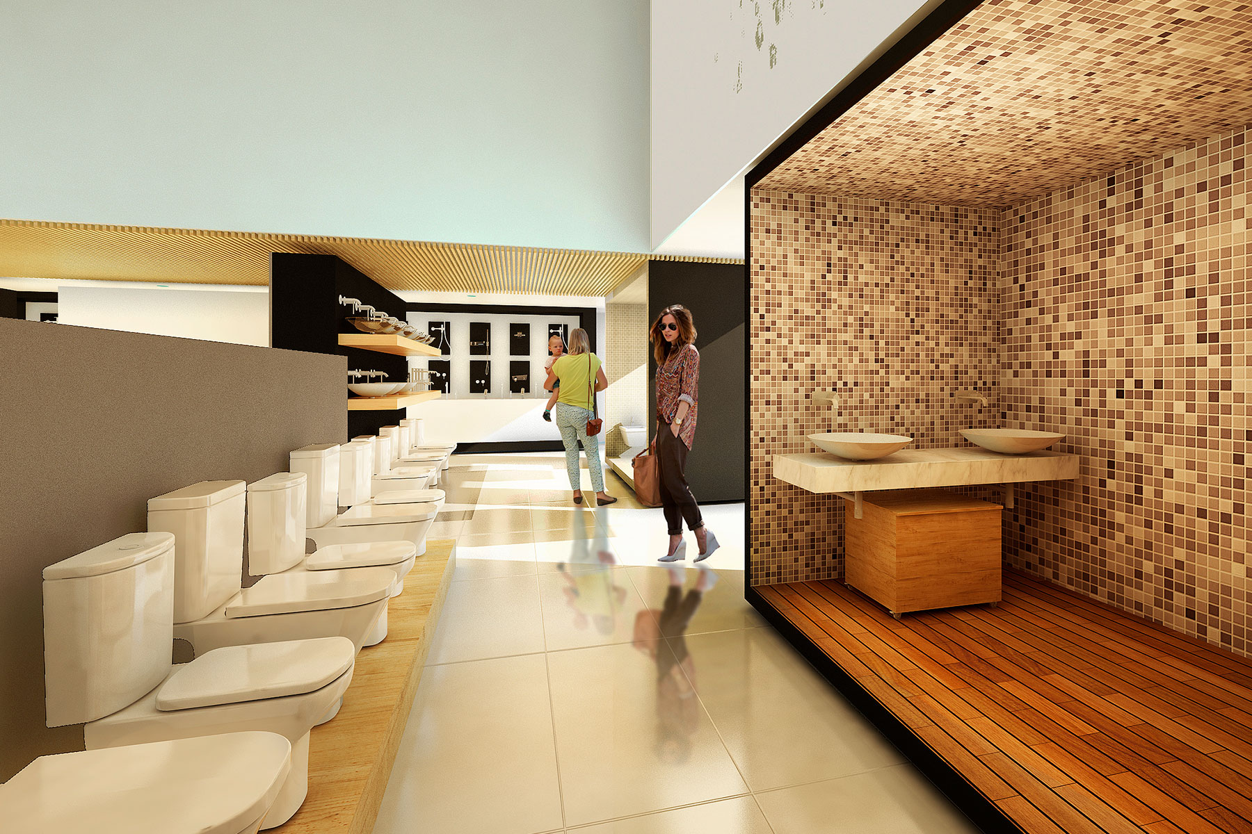
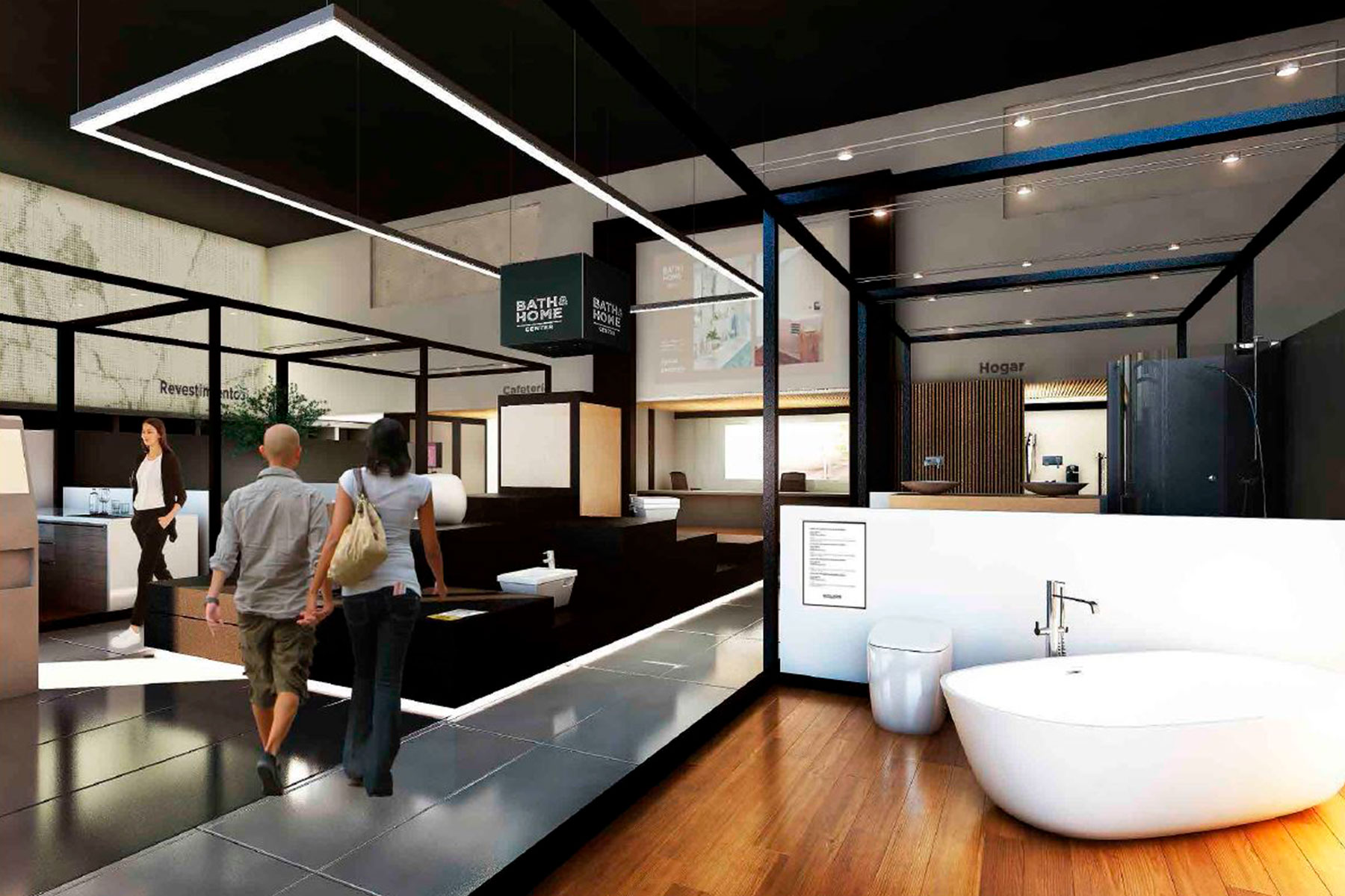
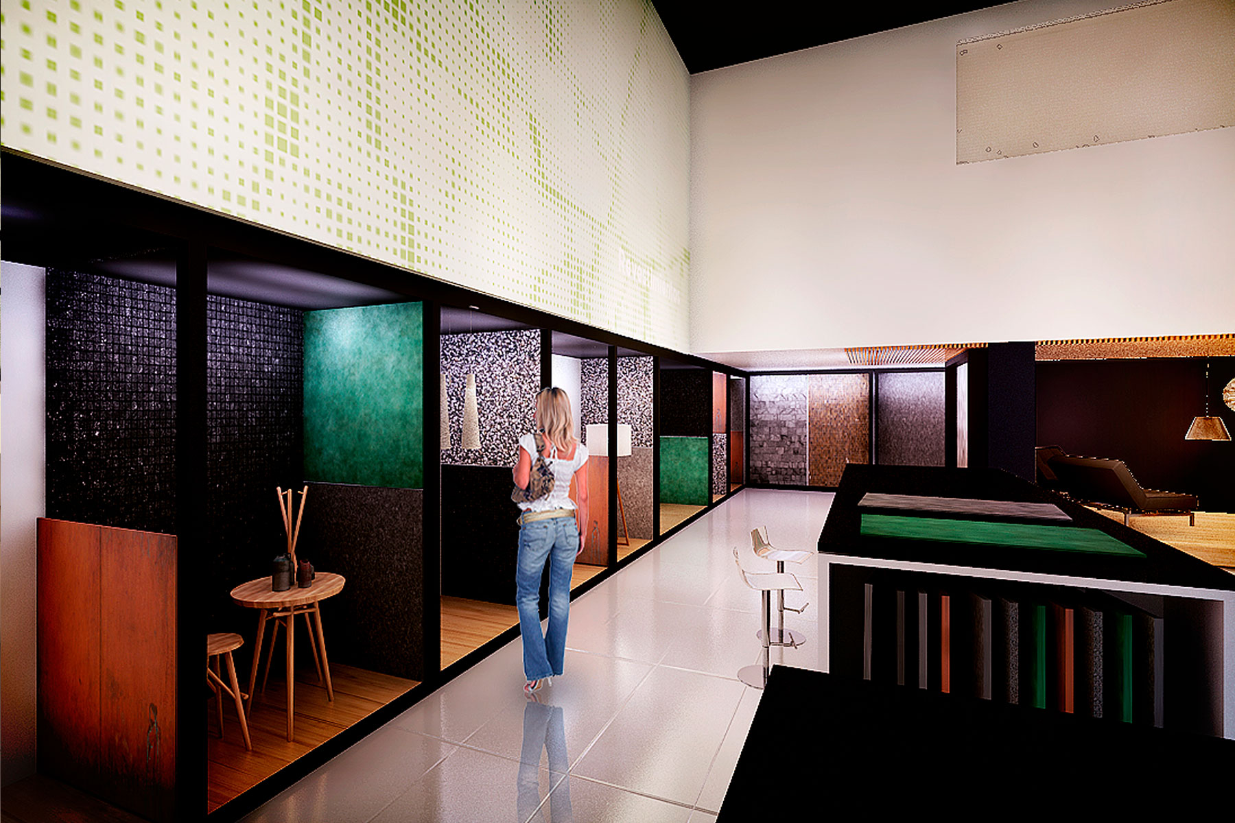
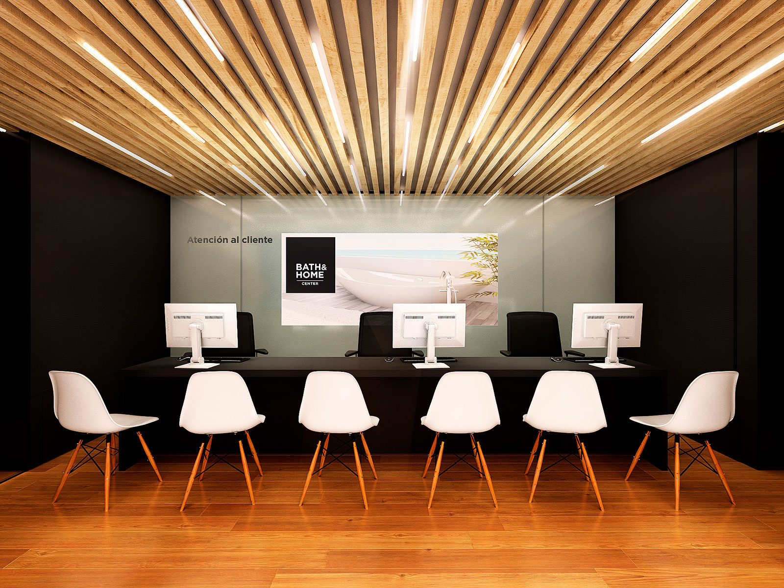
One of the first proposals was to divide the premises they occupied to give the brand a space of its own. Then we organized the showroom in different sectors: warehouse, floor and wall coverings, complementary lines, bathrooms and central area. The project defined where to place the new shelves, changed the lighting and the ceilings and designed the equipment. In the central sector, illuminated cubes were assembled for the temporary exhibitions, and the reception area was located at the back.
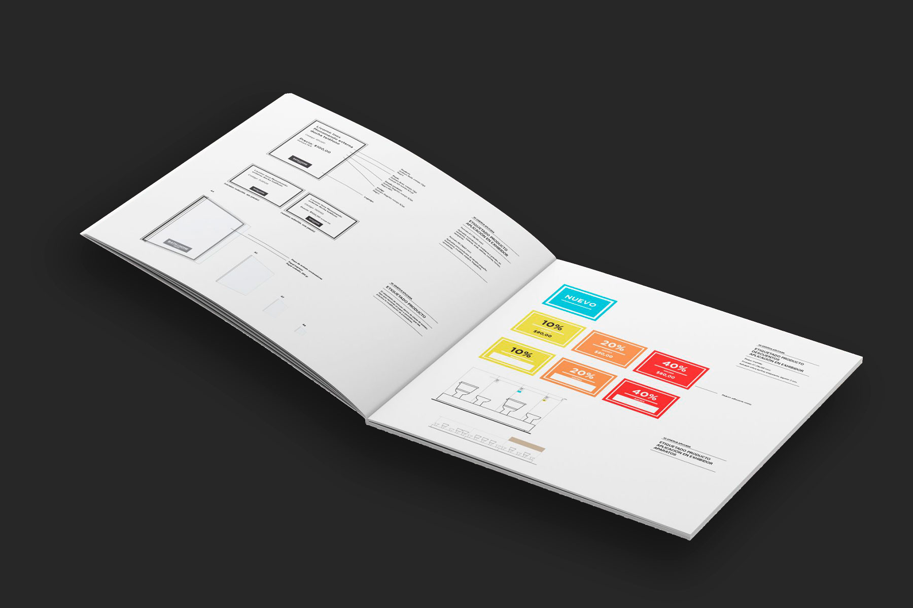
In a brand manual we documented the design criteria and details for the project and the construction of the stores. This tool, which optimizes management and resources while maintaining a high standard of quality, is a guide that is used in all the brand’s spaces. It consists of a chapter on the spatial layout of the project and thematic chapters (architecture, equipment and applied graphics) that include cards and details of all the elements to be defined.
The messaging strategy covers everything from the facade sign to the labeling of the products, giving coherence to all the elements that make up the visual landscape of the brand.
