
-
Program:
Bank agency
-
Status:
Built, 2017
-
Area:
590 m²
-
Photography:
Juan Alberto Andrade
-
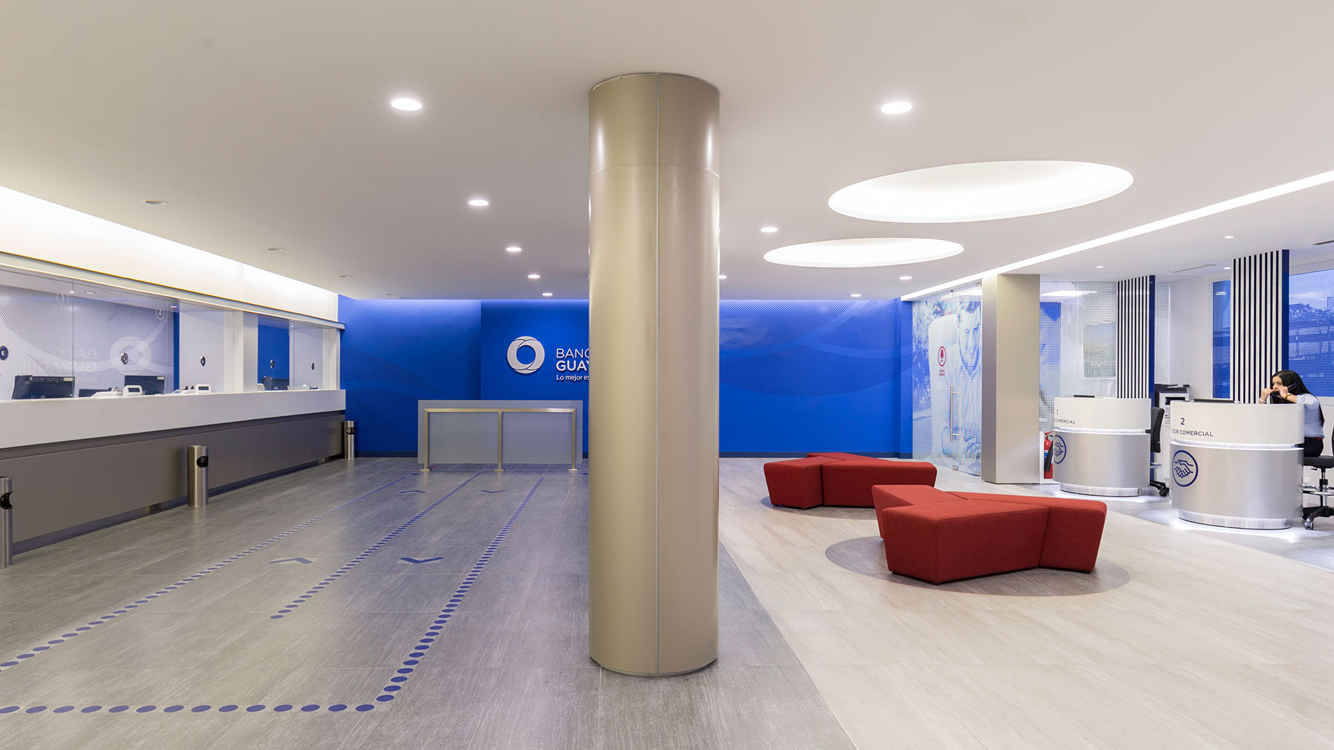
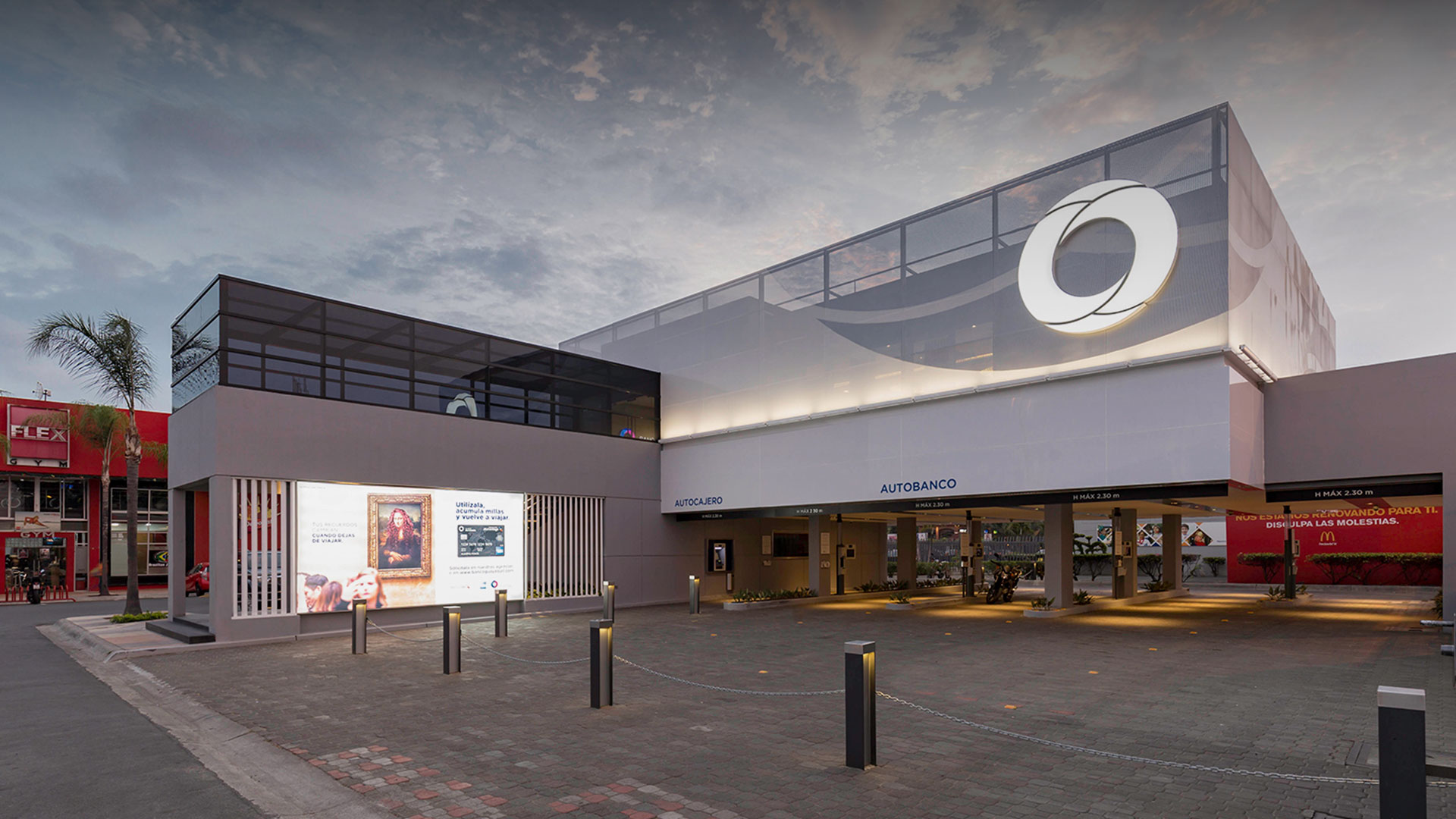
The redesign of Banco Guayaquil's branches is aimed at revolutionizing the user experience and enhancing the bond between the clients and the institution. This architectural overhaul strives to craft an environment that mirrors the bank's corporate values, employing an architectural language that is simultaneously uniform and adaptable. This approach ensures a striking visual impact and the ability to fit into a variety of contexts and scales.
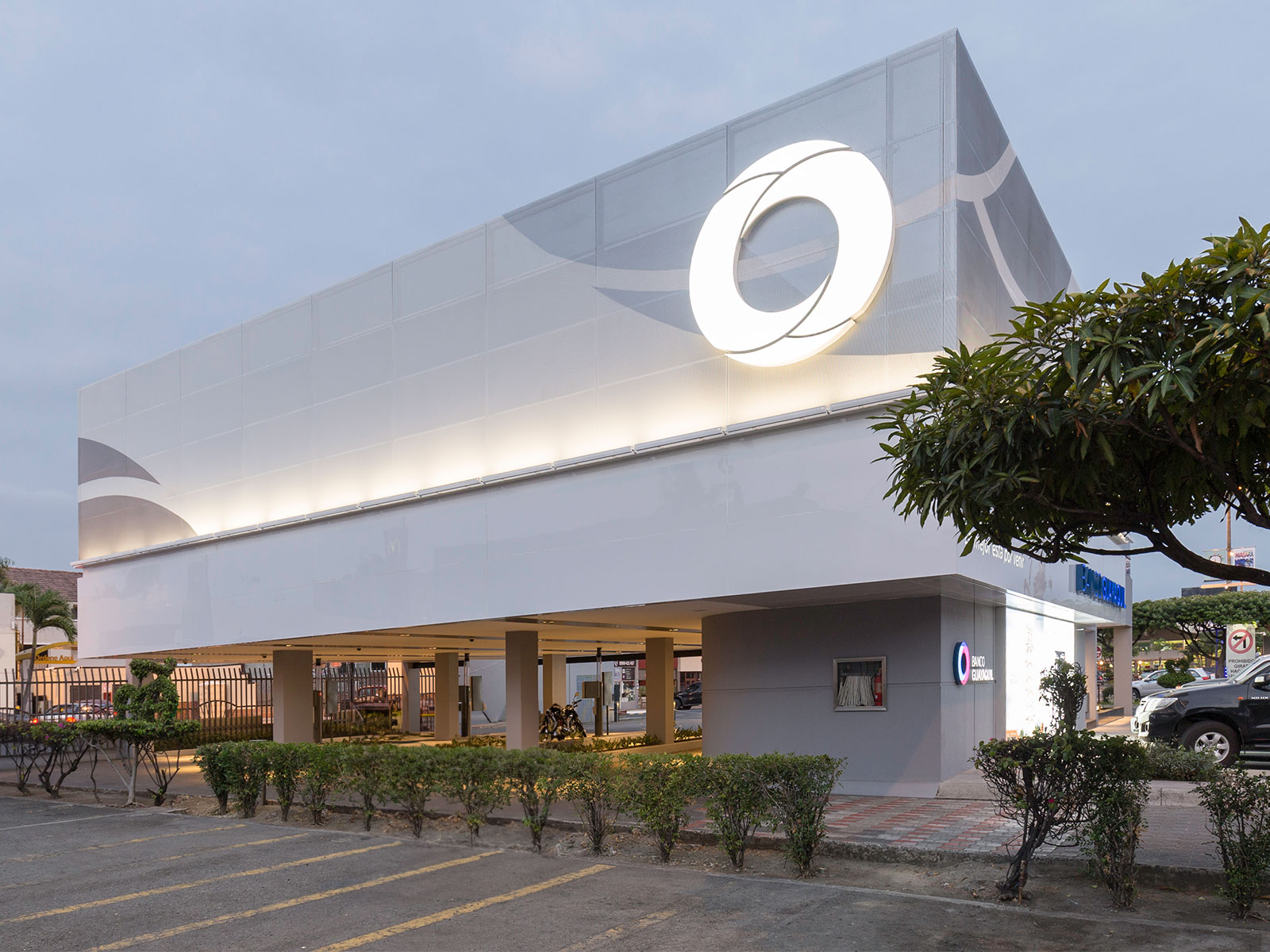
At the heart of this redesign is a concept reminiscent of a public square, where the central area serves as a hub for interaction and service, positioning the user at the epicenter of the experience. This innovative strategy is intended to shift the traditional view of bank branches, fostering a space that is more inviting and customer-focused.
Spatially, the branches are designed to operate as a system of both standardized and flexible elements. The central public area is thoughtfully proportioned and arranged in relation to the surrounding functional zones, which are designed to be versatile, catering to the unique requirements of each branch.
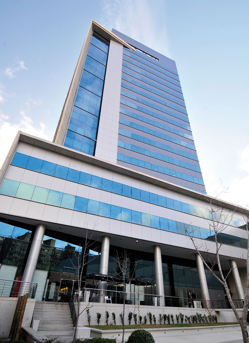
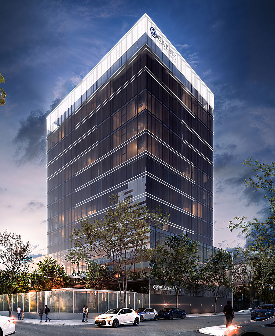
The branch facades stand out with their extensive use of glass, offering unobstructed views into the interior and creating a dynamic, welcoming atmosphere for customers. Inside, traditional closed meeting spaces give way to open consulting stations, encouraging more direct and personalized interactions with clients. The selection of colors, lighting, and furniture is meticulously curated to echo the bank's corporate identity, emphasizing a harmonious blend of color and form.
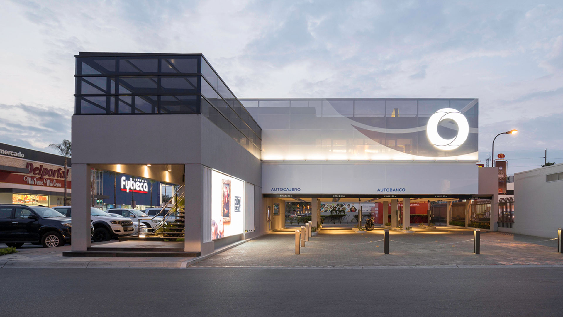
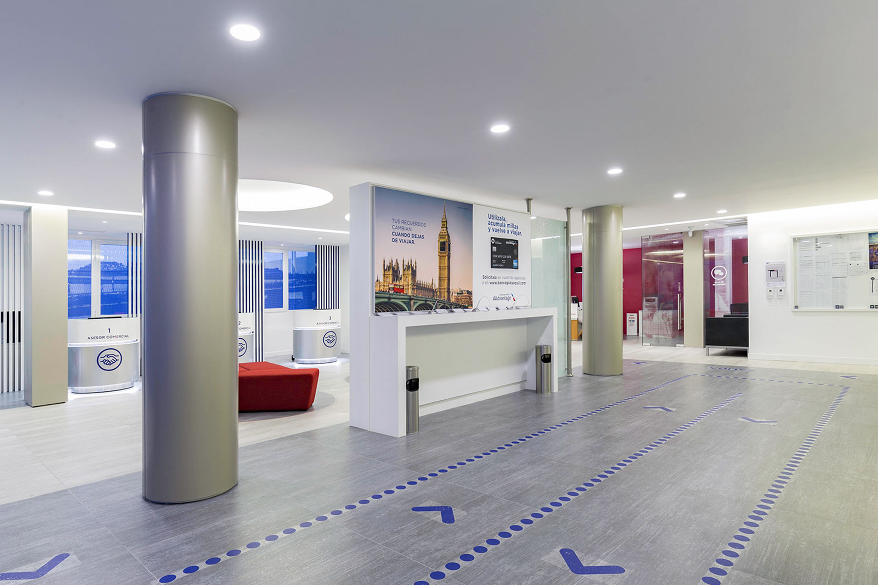
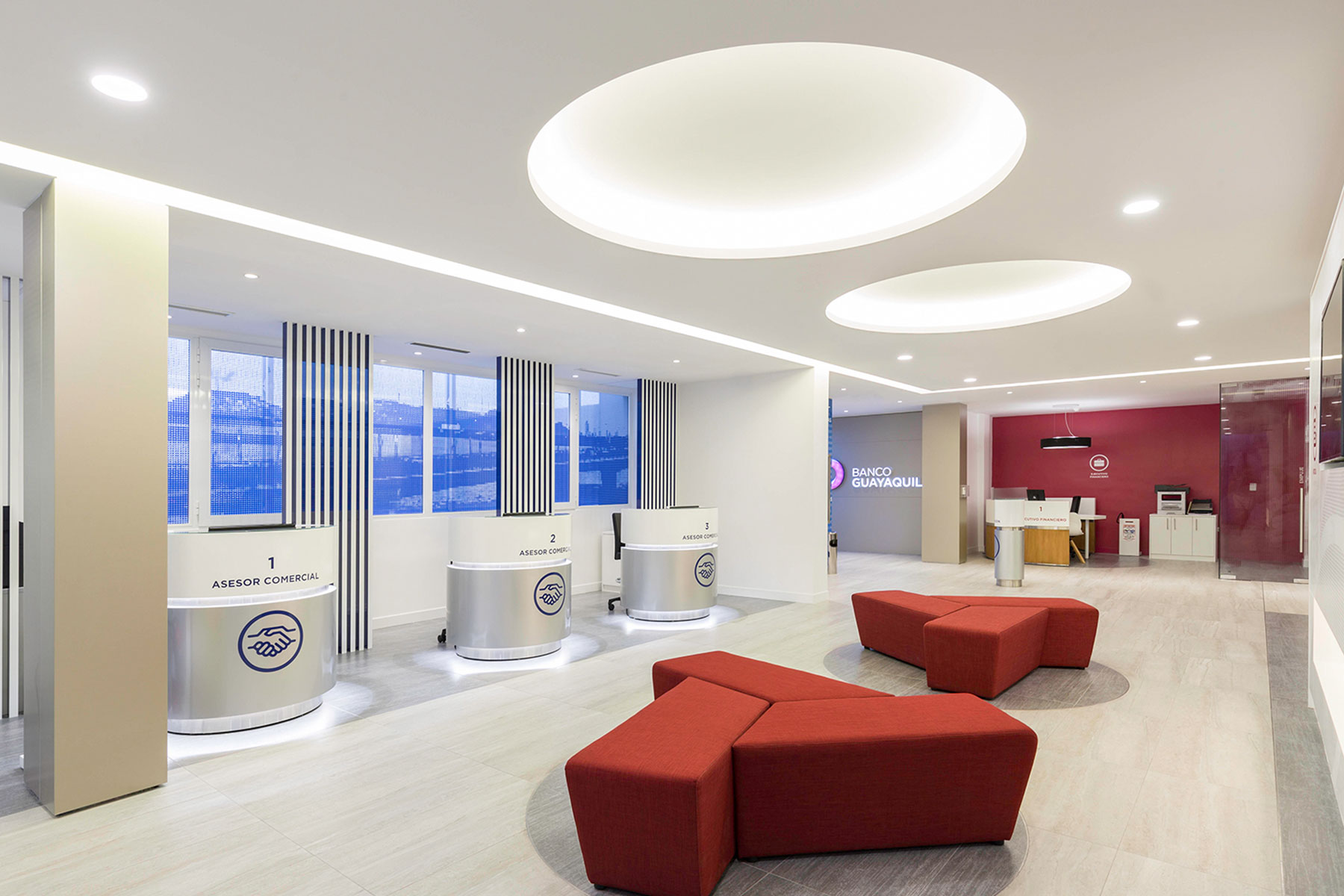
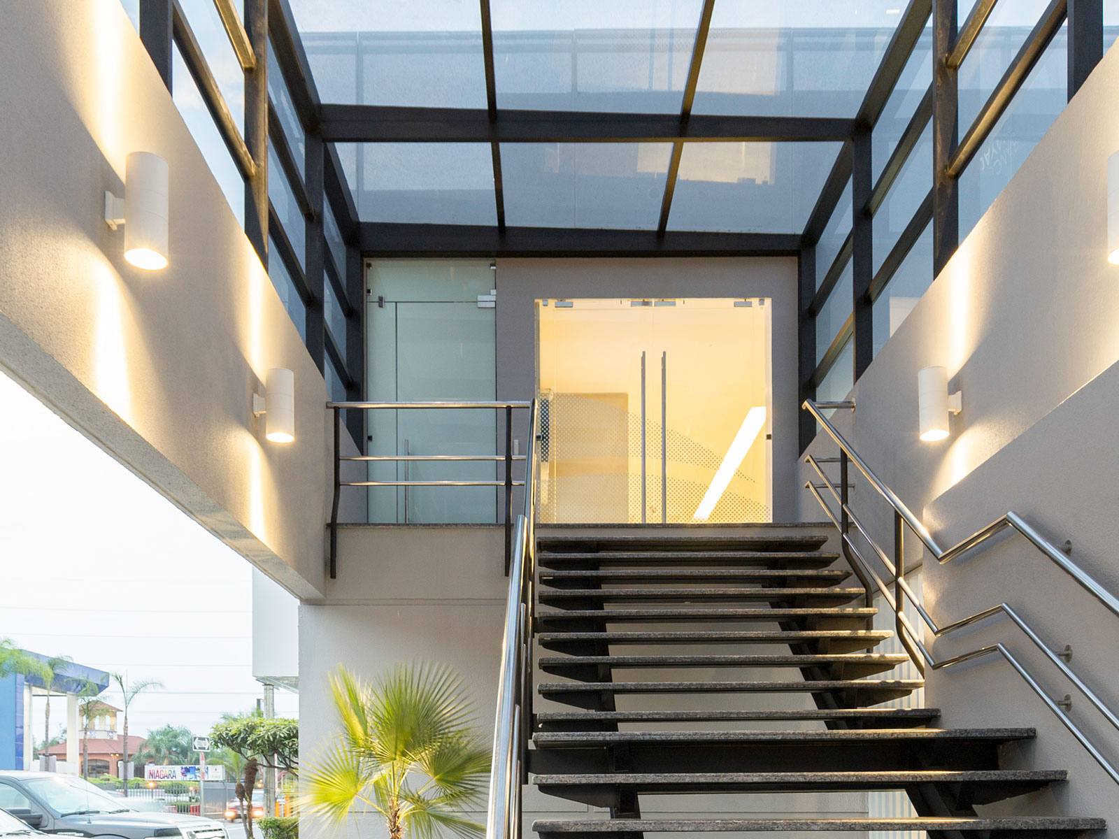
The signage system's design is pivotal in forging a cohesive identity that bridges the brand with its architectural expression. This is achieved through clear guidelines for visual elements, ensuring that the bank's identity is consistently and accurately portrayed, both in practical and symbolic terms.
Branches developed under these guidelines showcase a range of designs that maintain stylistic and functional consistency. This uniformity across branches offers clients a distinctive and consistent Banco Guayaquil experience, contributing to the creation of spaces that are both expressive and contemporary. This sets the bank apart in a competitive marketplace.
Overall, the redesign of Banco Guayaquil's branches marks a significant leap in the fusion of corporate architecture and brand identity. By focusing on user-centric design and spatial flexibility, the project sets a new benchmark in banking space design, prioritizing accessibility, transparency, and visual harmony to enhance the customer experience.
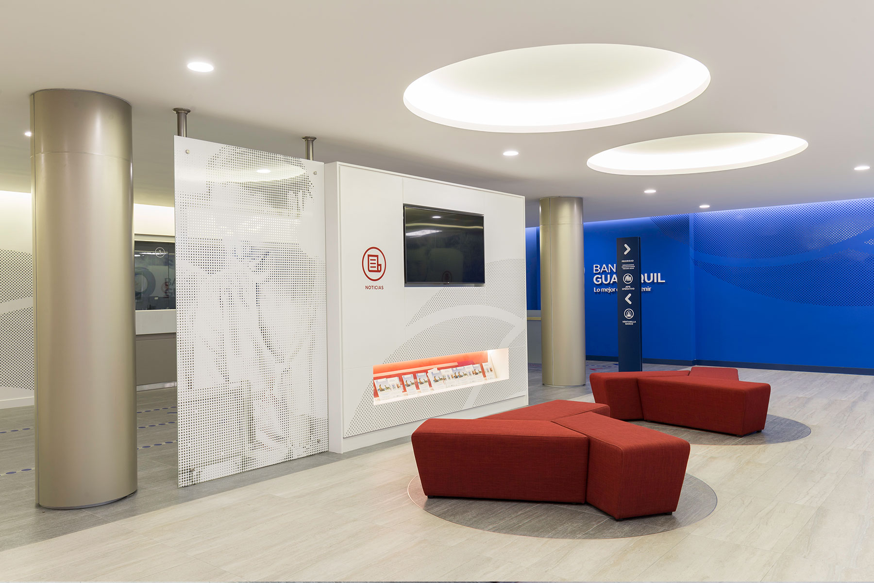
Visual Communication and Signage Strategy
The visual communication and signage strategy developed for Banco Guayaquil's buildings aimed primarily at clearly expressing the institutional visual identity, as part of a comprehensive renewal of its corporate image and operational structure. From this perspective, the project sought to consolidate a strong institutional identity, optimize the working environment, and provide clients and employees with a high-quality spatial experience consistent with the bank's values and philosophy.
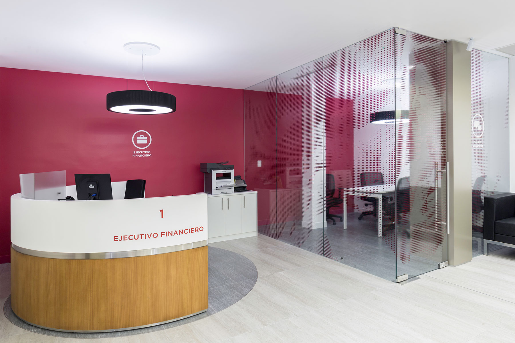
The design decisions underlying this visual communication system were intended to reduce the visual clutter caused by the coexistence of multiple graphic elements within interior spaces. To achieve this, a comprehensive graphic system was established to clearly organize the environment, facilitate user orientation and circulation, and enhance the perception of spatial openness.
Integrating diverse functions and messages onto unified graphic supports transformed conventional architectural surfaces into versatile platforms for institutional communication. This system strategically leveraged large interior surfaces to effectively project the bank's corporate identity.
Through the careful use of scale, shapes, dot patterns, and institutional colors, the implemented signage clearly identified specific areas, provided varying levels of privacy, and created a coherent visual atmosphere aligned with Banco Guayaquil's institutional philosophy and values.
